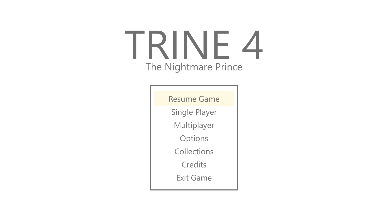
UX/UI Design
Context
Trine 4 was created at an interesting point in the series. The first two instalments were done in 2.5D, with three dimensional environment, but with movement only in 2D. The third instalment went full 3D, which was a fresh take for the series, but not well received. So Trine 4 returned back to the 2.5D approach.
I was, together with the UI artist, in charge of the menus and their flow as well as the HUD.
Previously, the menus were designed in isolation and implemented at the very end of production as quickly as possible, which resulted in a lot of iteration and wasted time. The UI artist and I had experienced this and wanted to change how menus are created not only in this project, but the entire company.
Designing the Menus
Most of the menus were fairly straight forward and mostly copies of previous instalments of the game. I made wireframes of them while the UI artist created the art style and assets for them. Before implementing anything we turned the wireframes into a clickable prototype with Adobe XD to give a sense of how the information would be displayed and how the transitions would feel.
By the end we had a proven layout for the menus as well as clearly defined UI components that the programmers could implement once and use across all menus. This sped up the implementation as our documentation informed the software architecture and let the programmers transitioning from gameplay implementation to jump quickly into implementing the menus. They could also check the desired functionality from the prototype, which further sped up the implementation process by cutting down on the number of iterations needed.
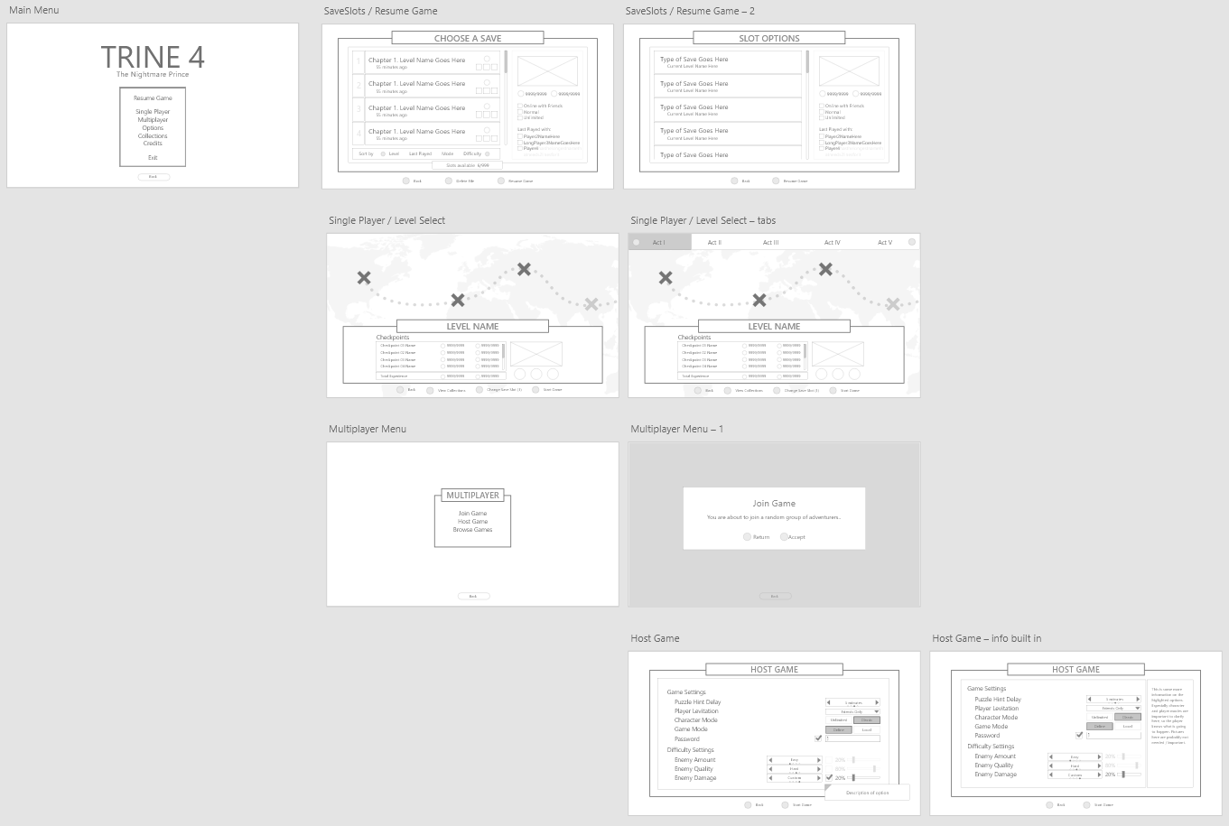
Screenshot of some of the wireframes for Trine 4 menus made with Adobe XD.
An interactive prototype made with the wireframes for Trine 4 menus
Early on, we identified two menus that would need extra attention: the level select menu and the skill tree.
Level Selection
The level select menu was tricky. In Trines 1 and 2 it had been a list with a screenshot of a memorable moment in the level and basic level info. Trine 3 introduced a full-blown board game that the player would navigate with one of the playable characters. As the game was in 3D, this worked beautifully. The team wanted something similar for Trine 4, but as the game was in 2.5D, a similar map simply wouldn’t work as it would allow more dimensions to move in than the game itself.
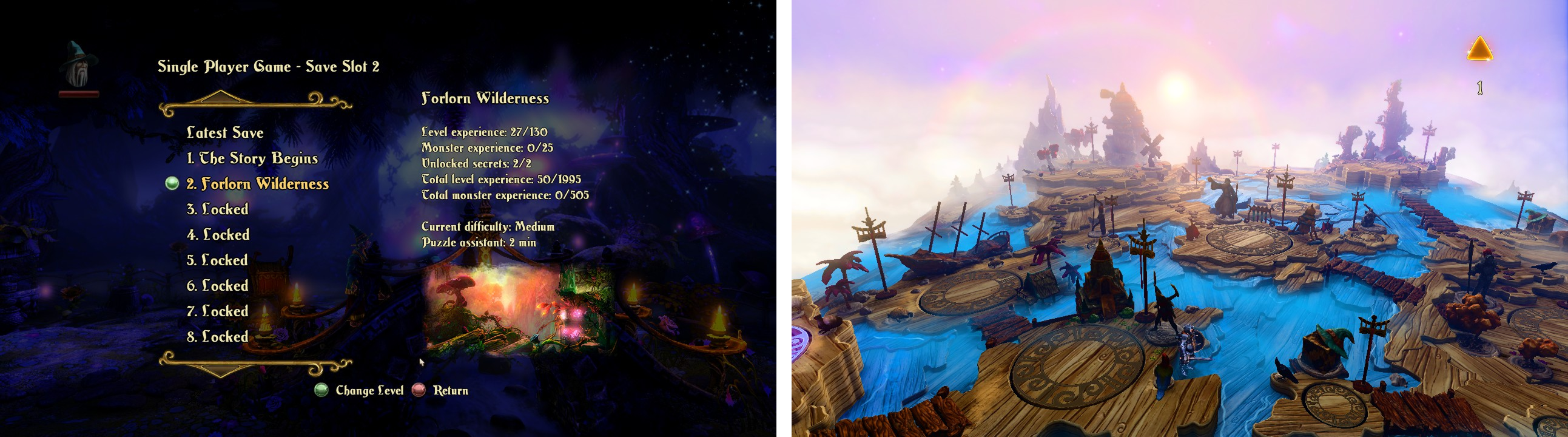
Left: The level select screen from Trine 2. Right: The level select screen from Trine 3.
I went through the entire Design Thinking process with this menu.
I started by empathising with the team and users. Both had really enjoyed the visual design, though some players and reviewers felt going through it broke the flow of the story and immersion somewhat. The team felt the map was much better than the list in previous instalments, but struggled to come up with a way that felt immersive and true to the mechanics of the game.
Based on this information, the problem statement became: We needed to create a half-way space between a menu and the game world that did not break the flow of the game and employed a metaphor that worked for the game world and was faithful to the rich visualness and the mechanics of the game.
Together with the team we brainstormed multiple ideas, including tapestries and storybooks, but we kept coming back to the map as the best metaphor for the journey. I got an idea on how it could work and used Axure RP8 to make an interactive prototype for the team to test.
This is what the prototype looked like.
The prototype was a huge success, not only proving the concept, but also eventually cutting down on implementation time as the developers could refer to it to check for desired functionality. While the menu was among the most complex menus created for the game, it was also one of the fastest to implement.
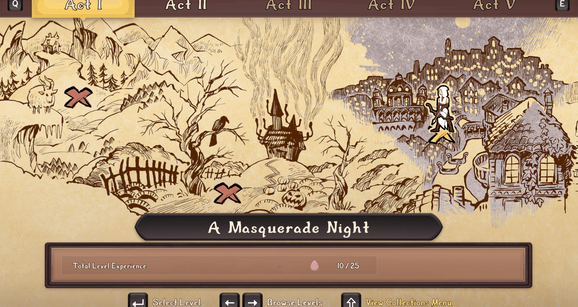
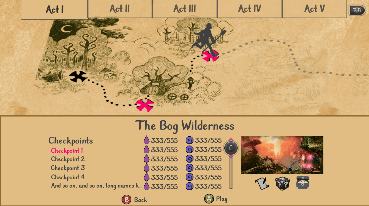
This is what the the level select menu looks like in the game.
Skill Tree
The skill tree was more straightforward, but it contained a lot of information and was a central part of the experience, so we wanted to make using it feel extra rewarding. Unlike previous instalments of the game where each skill was optional and could be acquired in any order, the player got certain skills at specific times in the game, while upgrades to those skills were optional and could be acquired at any time after the main skill was unlocked.
Skill trees in Trine (left) and Trine 2 (right).
I designed the layout for it and the UI artist focused on making all the interactions feel very rewarding through small animations and visual effects.
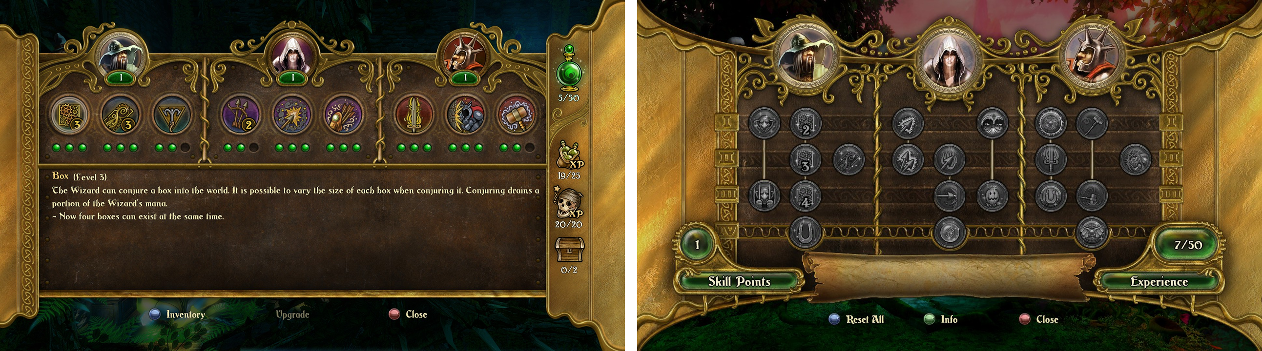
Mockup I made for the skill tree in Trine 4.
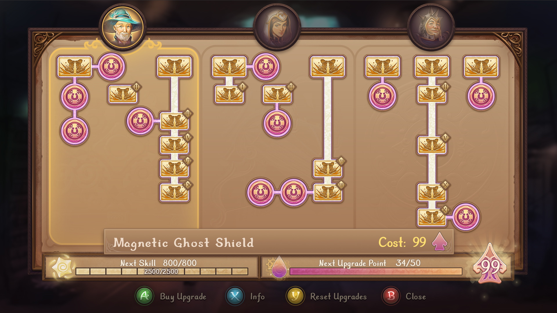
An animated mockup of the skill tree to showcase the different microinteractions created by the UI artist.
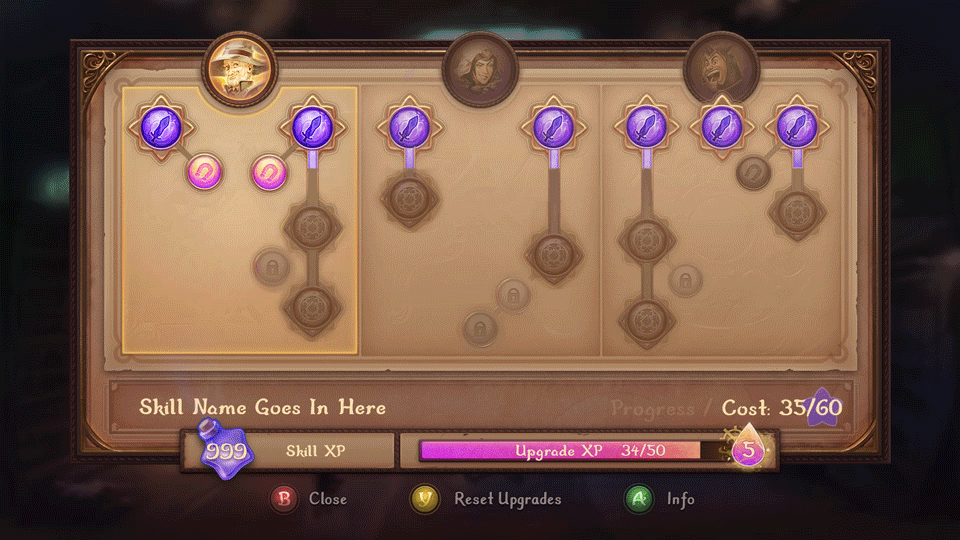
We had time to do this as we were involved with the project from the start. However, in this instance this came with a downside too. The number of skills grew significantly toward the end of the production and the layout no longer worked. In the end it was changed to a much simpler, grid-like layout to make it look cleaner and navigation work better.
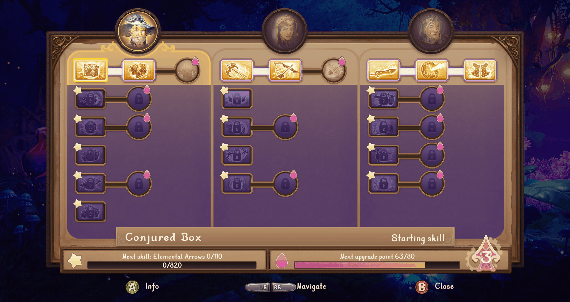
The skill tree the game shipped with.
Results
In this project we trialed a new UI pipeline that sped up menu creation from start to finish and streamlined communication across all disciplines required for UI creation from design to art to implementation, as well as QA and localisation. The process was later adopted across the entire company.
The level select menu especially was praised by players in different communities as “the perfect combination between a boring list and a world map, which you can travel in!”
The menu designs were deemed so well made that they were copied with only minimal changes to Trine 5.